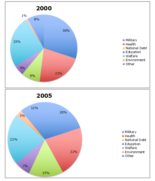
The charts above show the changes in tax spending for a nation in 2000 and 2005.
Summarize the information by selecting and reporting the main features, and make comparisons where relevant.
Write at least 150 words.
The two given pie charts depict the changes in tax spending across a five year period, with the first chart showing how spending was done in the year 2000, and the second illustrating how the money was used in 2005. Key areas of investment include the military, health care, the national debt, welfare, and education, whilst the environment and ‘other’ complete the listed categories.
One of the most significant trends concerns military spending, which accounted for 30% of the total spend in 2000 (ranked first of all categories) but fell to 20% and third place in 2005. It’s place as the largest beneficiary of tax spending has been taken by joint-leaders, both on 22%: welfare (which itself decreased 3%, down from 25%), and health (remaining consistent with it 2000 level of 22%). With two of the top three areas of spending experiencing reduced percentages, the drop-off was balanced by rises in the budget for all other areas: the national debt (up to 15% from 9%); education (rising from 5% to 7%); the environment (from 1% to 3%); and ‘other’ (8% to 11%). None of these categories, however, changed in their ranking position, meaning despite its growth in percentage terms, spending on the environment remains in last place. In short, whilst the distribution of money was more even in 2005, it was only the large reduction in the military allocation that altered the listing.